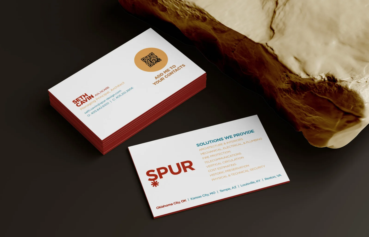
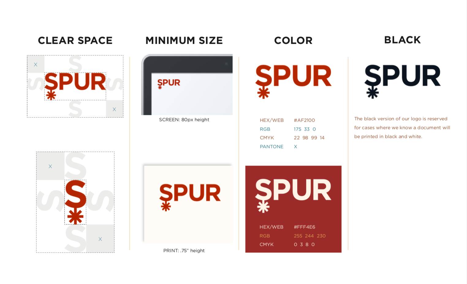
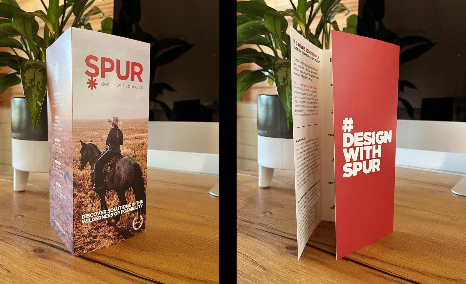
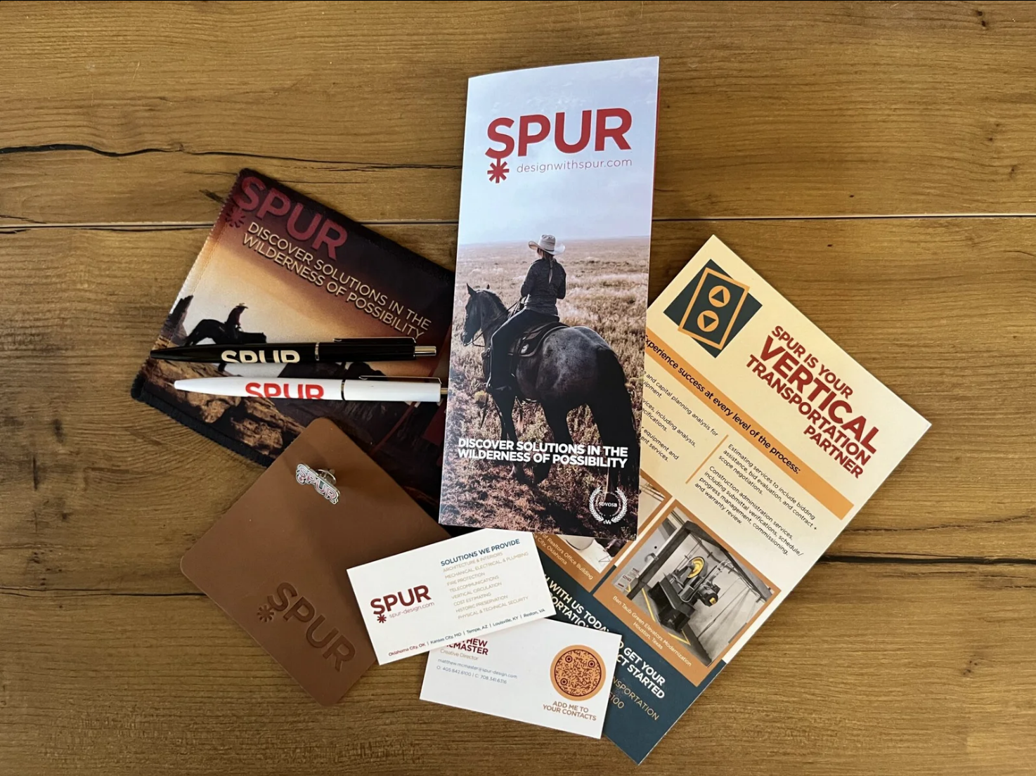
Spur had nearly fifteen years of history, but their brand still spoke like a small boutique studio. The challenge was not reinvention. It was maturation.
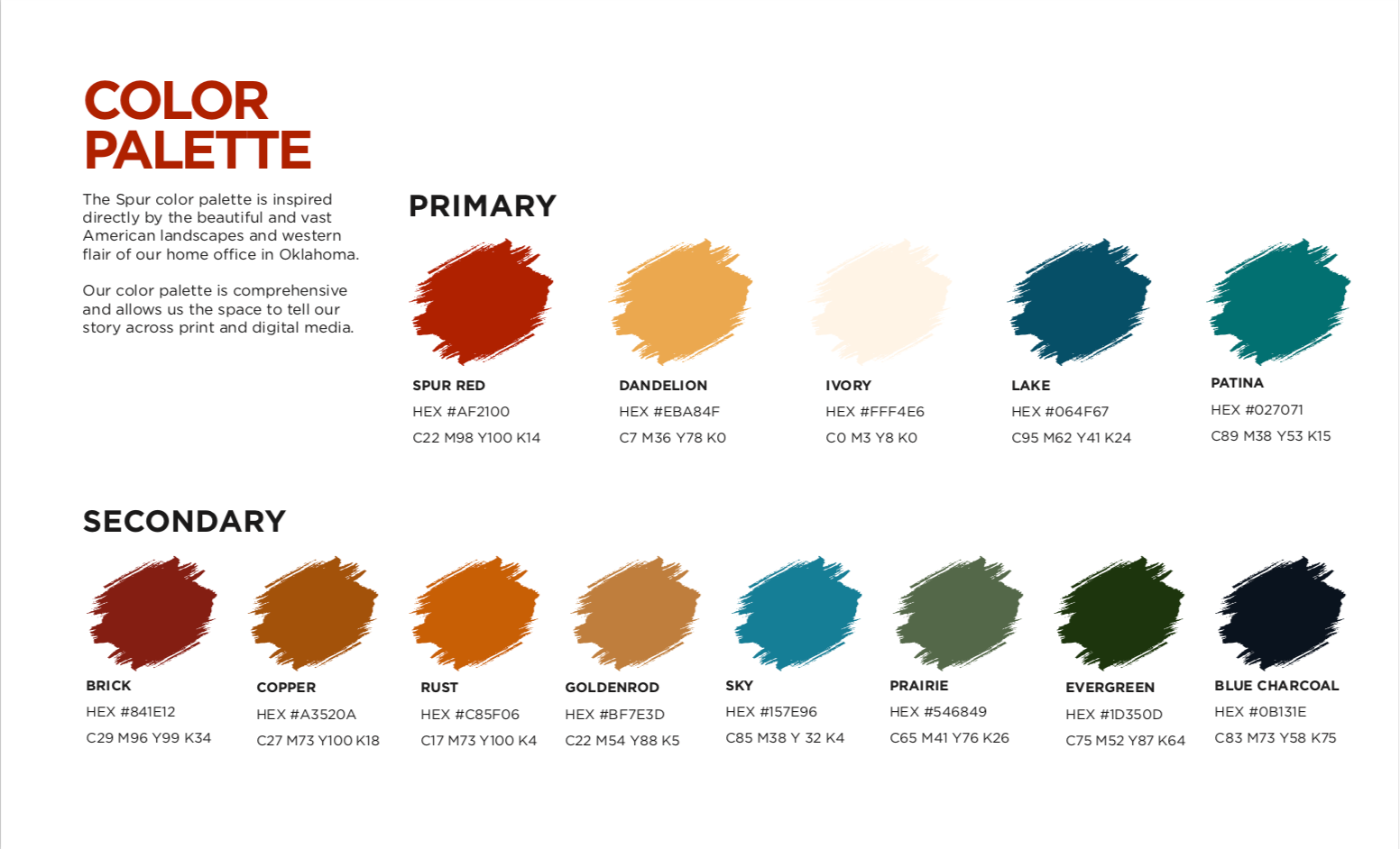
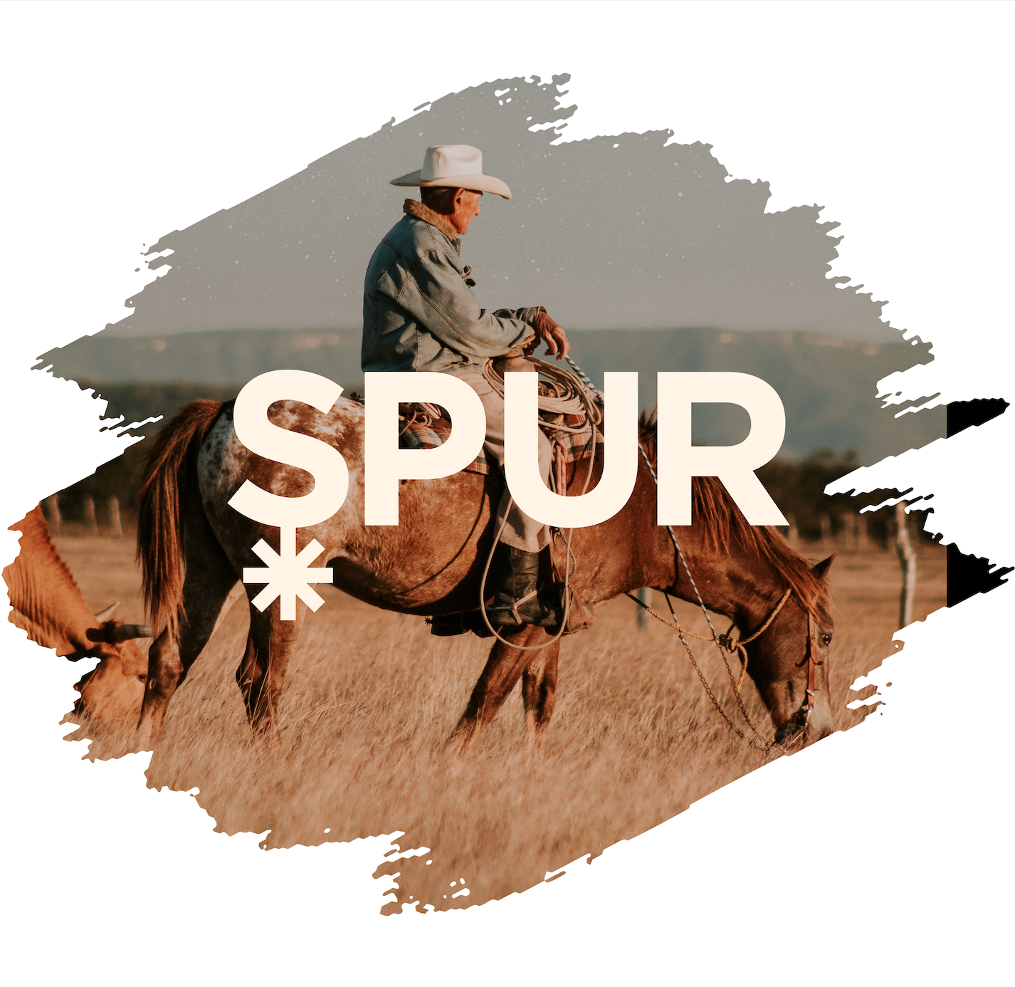
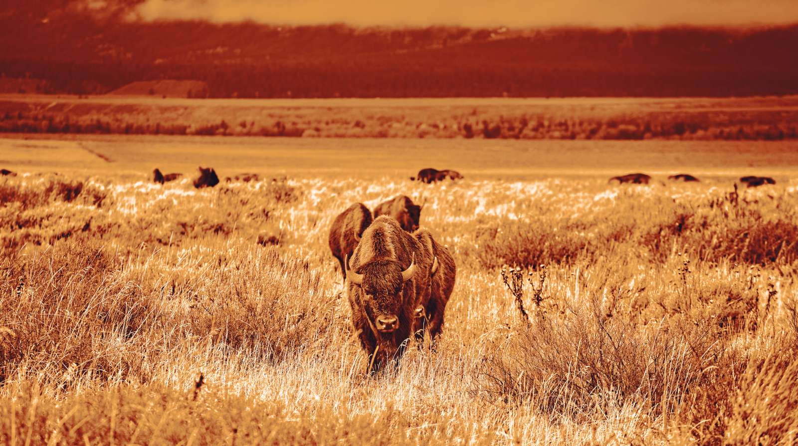
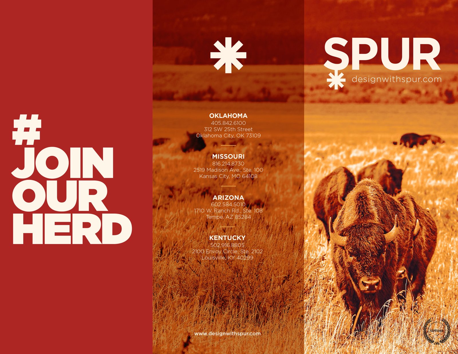
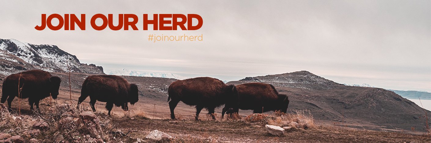
I approached the refresh by honoring Spur’s roots while evolving their presence. Their original kitschy western motif gave way to something more seasoned and weathered. The visual language shifted toward grittier landscapes, experienced cowboys, wild buffalo, and colors pulled from Oklahoma’s plains and skies.
The intent was subtle but meaningful. A brand shaped by time, not trends. One that felt confident in its scars and steady in its craft. The refreshed identity allowed Spur to present itself as a studio with depth, history, and earned perspective while remaining unmistakably itself.